Color your Brand: A Step-By-Step Guide to Brand Color Selection
Ever notice how the colors in a restaurant make you want to stay or leave? Your favorite date-night restaurant surrounds you with warm colors and dimmer lighting to make you feel at home. Gentle music and the smell of fresh food permeates the air to soothe you. This atmosphere was created to invite you to stay and keep ordering
On the other side of the spectrum, bright and white cafes make you move quicker while you are on the go. Chairs are a bit less comfortable, but the service is fast and convenient. These places are meant to offer the best service to those on the go. The point is not to make you stay, but to feel awake and ready for the day!
Color affects your perspective in ways you’d never imagine. Color can determine which razor you buy or what car you drive. Color of clothing can mold your opinions of a person without your realizing. Colors influence human perspectives… especially in brand-building.
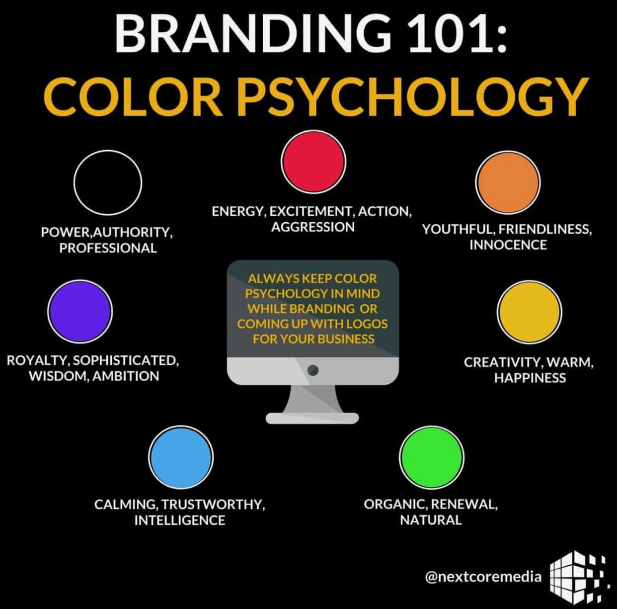
The brand colors can symbolize everything from attributes to missions. We have all seen a color chart like the one below. With so many color combinations out there, narrowing colors down by meaning can make the process more palate-able (get it?).

Now, let’s hit the drawing board to contemplate a few questions:
What adjectives do your audience associate with your brand?
Contemplate what your audience wants and what adjectives embody those wants. This requires a bit of research and a lot of listening. You can go directly ask your audience, if you have the resources. Polls and surveys are a great, cheap way to gauge audience perspective. The web is also full of research studies. They may not be customized to you specifically, but they often yield helpful information. If you want more custom research, you can always go to a research firm. This option is pricier than the rest, however, these individuals are highly versed in the realm of marketing research.
Record everything (even the worst ideas). You never know what you will end up using!
Widdle the list down to 2 or 3 adjectives.
There are bound to be adjectives that keep popping up. Perhaps your audience keeps bringing up similar ideas or your team agrees on a specific word. Once you find these words, you have… drumroll please… core attributes for your brand.
It would be smart to find all the ways your brand embodies these attributes. Whether it is through customer service standards or website layout, find ways to emulate those core attributes.
Find colors associated with those adjectives.
Look up what colors match what attributes. For example, orange is associated with youthfulness. Toy brands may consider using orange to show the childlike spirit in their products. Green is associated with organic, natural products. Notice how every organic brand has green in their logo? It is no coincidence, my friends!
Stumped? A great resource for this is the 99d Logo Color Generator from 99 Designs. In all honesty, I sat playing around with the toggles, just to see what I would find. It is a very helpful resource!
Design away!
Now that you have some grounding on the color spectrum, start designing! Make sure to stick to the color palate you created to create uniformity across all platforms. This will help your audience associate specific visuals to your brand.
The most important thing here is to have fun with it. Passion can be seen with almost anything you do. Make your passion known through your designs!


